Spiral brand guidelines
Essential resources for maintaining Spiral’s visual identity
Download brand assets
Usage
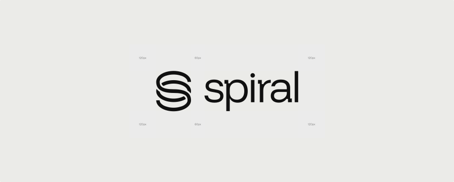
Provide plenty of space around Spiral assets: two-thirds of the logo’s height above, below, and to each side, and one-third of it between the symbol and the wordmark. For a logo 180 px tall, that is 120 px and 60 px. Make them big or make them small, but keep the space in proportion and give them room to breathe.
Wordmark usage
Use the Spiral wordmark whenever possible in your references to Spiral. We recommend monochrome applications, paired with the brand colors outlined below.
Symbol usage
In constrained spaces or symbol-focused layouts, the Spiral mark works as a standalone identifier. Reach for it when the wordmark won’t fit. The full wordmark carries stronger recognition with most audiences.
Color guidance
Spiral’s palette centers on a neutral grey foundation, from soft light grey (#FCFCF9) to deep charcoal (#171716). The blue accent (#1D0FED) is reserved for details and moments of emphasis. It brings energy without dominating. Use the grey scale for primary elements and backgrounds, and bring in blue for links, focus, and the one element on a screen that needs attention.
Primary colors
White
FFFFFF
grey-50
FCFCF9
grey-100
EBEBE8
grey-200
DFDFDD
grey-300
D4D4D2
grey-400
BEBEBB
grey-500
646462
grey-600
3C3C3A
grey-700
2B2B29
Black
171716
Blue
1D0FED
Secondary colors
Purple
8731DD
Pink
DD317E
Orange
F27332
Red
E43134
Green
17B65A
Iconography
Spiral uses Google’s Material Design icons across digital and physical applications. Recognizable and clean, they keep every surface consistent.
